Monday 29 February 2016

Alcohol Landscape


Welcome back.
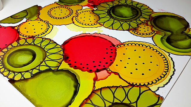
I thought I'd try a landscape with my alcohol inks this weekend. 
I started out with a piece of 200gsm Yupo, about 5"x5". I gave it a wash of blending solution and then drizzled my colours across the paper, tipping it to help the inks move.


 Honestly, I got in a right mess, adding more ink, more blending solution whilst mumbling lots of 'Grrrrrs' under my breath as the idea in my head failed to appear.


I decided to use my TH blending tool to splodge some colours and blending solution about, desperately trying to create the vision in my head. The mess grew, as did the 'Grrrrrs' under my breath and then, as is often the case with these magical inks, something appeared. The felt fibres from my blending tool, that had annoyingly stuck to my ink, suddenly looked like twigs.


The vision in my head had gone, the inks had taken control and given me this instead. As I said before, don't be too hasty to give up with alcohol inks if it all looks like a hideous mess. Sometimes it really is worth walking away, sitting back or revisiting another day.

Saturday 27 February 2016

Pop-Up Inking


I posted this card the other day while 'Guesting' over at MFT and several people emailed asking how I made it, so I thought I'd share today. I hope my instructions make sense and shout if they don't.


Firstly I used 200gsm / 74lb Yupo, dripping 1 drop of ink at a time and puffing it about with my Tim Holtz air spritzer as well as allowing some drips to naturally 'bloom'.
I used Stream, Sail Boat Blue, Indigo & Citrus.  


Once dry, I ran it through my ol' Cuttlebug with MFT's Pop-Up Birthday die positioned in the centre. I then adhered the Yupo to a piece of white card, added 3d foam to the back and stuck it onto my card base.


A few blobs of silver glitter et Ta-Da...this card is finished.

Friday 26 February 2016

Alcohol Ink Chart & Storage


I thought I'd share my alcohol storage and colour chart in case it helps anyone.
Firstly I use Ranger's Adirondack alcohol inks and store them in this A4, plastic box which you can easily get, dead cheap from places like The Range or Hobbycraft, etc
There's enough room for the entire collection of inks, a blending tool, felts, a bottle of blending solution, a mini-mister, cotton-buds and the kitchen sink.
I haven't bothered with colour-coding the lids as it's quite easy to find the colour I need. I divide mine into Mixatives, Pinks & Purples, Greens & Browns, Yellows & Oranges... you get the idea.


There is a blank, downloadable colour chart on the Rangers website here. However, if you want to print it out on Yupo, which will give you best result, the chances are that your printer ink will never dry and just smudge, so I created my own on an A4 sheet of the 110gsm version & simply used a rule & black Sharpie to draw my lines. By doing it this way I found that when I dripped 1 drop of ink in each section, the Sharpie somehow created a barrier and the ink didn't spread into the next colour segment.


I've stuck the colour chart on the inside of my lid.
The beauty of a Yupo colour chart is that you can see the true colours and have a constant reminder of how a colour reacts, eg... Cool Peri has a pink surround, Shell Pink a cream one.


Thursday 25 February 2016

Desperate Plea for Help

Please forgive my desperate plea.


My daughter Sophie has entered a design competition with Oxford Campus notebooks and has reached the final 5....Eek!!

The winner will receive £200 and if Sophie wins, she would donate it all to her charity fundraising total of £900 for the FutureSense Foundation who she will be volunteering with this summer working at an orphanage in Romania. The money will go towards rebuilding the orphanage as well as activities for the children there.

The winner is being voted for on Facebook and so my plea, yes...I'm begging...is could you kindly cast a vote for Sophie using the link below?

Her design is the paisley / floral one with the white lion logo.
The competition ends tomorrow (26th Feb') so I'd be HUGELY grateful if you could vote as soon as you've finished reading this post.
If you're able to share the link on your Facebook page too then that would be amazing.
THANK YOU SOOOOOO MUCH!!!

CLICK HERE TO VOTE

MFT Guest Design Post - Day 3

This is my 3rd and final day Guest Designing for the awesomeness that is MFT.
Thank you so much for having me!


My first 2 cards today feature the Rectangle Peek-a-Boo Window die. On my card above, I created an alcohol inked background, die-cut my little window and added a sentiment from the new Whimsical Greetings stamp set. 


On this card I die cut little stars from a scrap of black card using the Stars-in-the-sky-vertical die. I then created a little frame surround, again using the Rectangle Peek-a-Boo Window die and made a shaker card. The kitty cat, sitting at the window looking out at the nightime sky, is from the Cat-itude set.


Ok...do not adjust your screens for this one...I hope this makes sense how I made it. 


Using the Circle Burst stencil, I created half a rainbow of dots with distress inks on one half of my square piece of white card. I then used the Inside & Out Stitched Square STAX to cut out the individual frames, stuck them onto my card base but twisted each frame round to create a groovy look. As always, sequins to finish...mustn't forget the sequins...lol.


And finally to finish off my stint with MFT I've used one of my favourite dies, the  brilliant Pop-Up Birthday to create a centrepiece greeting to my alcohol-inked background.
Once again MFT, thank you so much for having me. 

Wednesday 24 February 2016

MFT Guest Designer - Day 2

Hello and welcome back to my 2nd day Guest Designing for MFT.
Today I have 3 cards to share with you featuring more of the fabulous, February release from MFT


This is the cutie-patootie Pure Innocence - Lucky Us, she's just sooooo sweet. I coloured her with my Zig markers, used the matching die-cut to cut her out and added her to a smooshed distress inked background. I added sequin embellishments and the little horseshoes from the Die-namics Lucky die set.


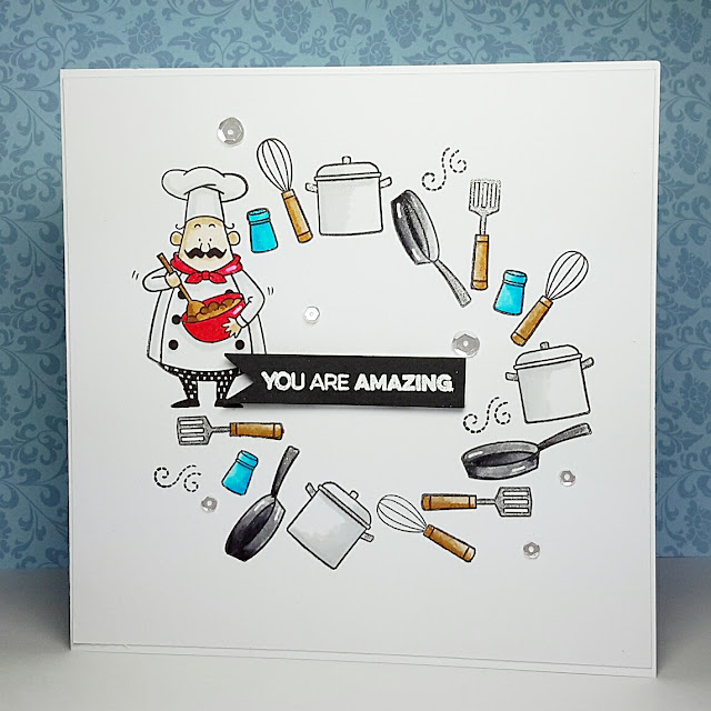
For my next 2 cards I used two of the cheeky chefs from the brilliant Recipe For Happiness stamp and matching die set. In the one above I wanted to create the impression that the chef was juggling his kitchen tools. All of these pots n' pans, whisks n' spatulas are in this set.  As well as 4 chefs and a whole host of kitchen tools, you also get lots of fabulous sentiments.


On this card I used the chef and his tools of the trade to create a circular framework to highlight the sentiment which is part of one of my favourite MFT stamp sets called Amazing

Monday 22 February 2016

MFT Guest Designer- Day 1

I'm thrilled to be joining My Favorite Things (MFT) for a few days as a Guest Designer, thank you so much for having me.
My cards today all have a Rainbow theme using many of the new products released by MFT earlier this month.


Regular stalkers to my blog will know of my recent addiction to alcohol inks, so for this card I used them to create a background of rainbow colours. Once dried, I used the larger Inside & Out Stitched Square STAX to die cut my frame, adhered that to my card base and then die-cut a Stitched Rainbow from the left-over centre piece. 
MFT has an amazing selection of what I call 'non-occasion' sentiment stamps. Stamps for times other than birthdays, Christmas, etc. Sometimes it's nice just to send someone a message of encouragement and the Rainbow of Happiness set is just perfect. A few 'regulation' sequins and this card is finished.


For my second card I created a more landscaped-looking background using my alcohol inks. I used the largest Inside & Out Stitched Square STAX again but this time I just used the centre panel with it's elegant stitched edge and added a sentiment, again from the Rainbow of Happiness stamp set.


My final card for today features another alcohol inked background to create a sky scene. Once more I used the Inside & Out Stitched Square STAX for my centre panel and die-cut a Stitched Rainbow that I coloured with my Zig markers. The clouds are from the new Die-namics Lucky set and the sentiment from the Pure Innocence Sunny Thoughts set.
I think we'd all agree that MFT's February release has been as amazing as ever.

Sunday 21 February 2016

Don't Give Up!


Hello and welcome back to another day of my latest addiction with alcohol inks.
I am thrilled that so many of you are now getting your mitts on these amazing inks. Apparently Tim Holtz / Rangers is bringing out his version of Yupo so hopefully those who are struggling to get hold of this magical 'paper' will soon be able to more easily. 


I've had lots of comments from people who are currently playing with their inks but feel they're just creating a mess. Please! Please! Please don't throw away your mess....leave it...walk away...even for a few days, then take another look. Trust me, I've got quite a pile of 'mess' that I use for experimenting on, testing pens, glitters and stamps. However, some messes can become something special. 


Honestly, I've waited all weekend for time to play, I had a bit of me-time and my mojo decided to do a runner. I could have cried...lol. I dripped ink, tilted the colours this way & that, dripped more colour, puffed here & there, sighed a LOT, added some more colour and droplets of blending solution and sat back HUGELY disappointed. 
It looked like a giant nosebleed or a hideous crime scene.


With nothing to lose, I thought I'd just add white 'doodly' dots and before I knew it, my mess was transformed, my mood lifted and even my biggest critique gave me the thumbs up.
So my message is don't chuck anything away. Use it as test papers and even better share it with me or someone else. Sometimes somebody will see a right cracker in your disaster and something amazing will appear.
I'd love to see what you're up to.

Saturday 20 February 2016

Doodling


Ok...you're probably gonna need your sunglasses for this one. 
This is another technique that I learnt from Joggles.
Honestly this woman has a lot to answer for...I live and breathe alcohol inks these days (quite literally...lol).


On this card I used the 74lb (200gsm) Yupo as I wanted my drops of ink to bloom into circles. If you've been reading earlier posts you'll remember that I've found some colours just don't seem to move on the lighterweight (110gsm) version without blowing them or adding blending solution.


I hope you can make out from the photos the colours I used.  Can you see on the first one how the Lemonade has a pink centre when dry and the Lettuce has an orange outer ring? These inks are so magical....can you understand my fascination?


I then dripped another drop of ink in the centre of each shape to create circles within circles. (Hope that makes sense?)


Once dry, I used Sharpie pens to doodle my 'blooms' into a flowery design.


I could sit here all day....and night, just playing with these inks....I love 'em!!

Friday 19 February 2016

Sailing By...


This is a weeny, uber-quick 4x4 inch card.


I started with a piece of left over 110gsm Yupo (a cut off from a larger piece) & swished a wobbly streak of Stream across the paper.


Once dried I did the same thing underneath the first streak....


...then repeated it one more time and my mini ocean was complete.


On a scrap of white card I stamped this sweet little sailboat from Lawn Fawn's 'Float My Boat' and cut it out.


I then cut a 2x2 inch square section of my mini ocean and, with a craft cutting blade, made a cut along the top of one of the waves. I coloured my sailboat with a Zig marker and slipped the boat into the sliced section.


I then mounted the Yupo onto another scrap of card, gave it an embossed frame and then stuck the whole thing with foam pads onto my tiny card.
As per, a few essential sequins, a sentiment from Paper Smooches, a hint of silver glitter and this card was finished.
Thanks for stopping by and don't forget to let me know if you're playing with alcohol inks.


Thursday 18 February 2016

Glossy Card Vs Yupo with Alcohol Inks


Greetings!
I've been asked quite a lot recently if you can use alcohol inks on glossy card stock rather than Yupo, as it appears not everyone is able to get their grubby mitts on my new found 'paper' of choice.
I hope my comparison helps to answer many of your questions but please remember I'm in no way an expert, these are just my findings with my experiements.

I'm working with Ranger's alcohol inks and showing the difference in 'movement' on 110gsm Yupo, which is a very lightweight, flimsy 'paper' and glossy cardstock that was sold to be used with alcohol inks.


 Ok...to start I dripped 1 drop of Mermaid onto each surface and simply waited for the inks to dry. On the GLOSSY card the ink bloomed into a good, even, solid, circle of colour & dried quickly. On the YUPO it moved more, dried slightly slower and if you look closely has textures and different shades to the edge that almost looks like a slice of a semi-precious stone


This time I dripped another drop and puffed the colour about with my Tim Holtz air spritzer. As the ink on the GLOSSY drys incredibly quickly you have to move in with the spritzer almost immediately. The ink on the YUPO doesn't dry as quick so you have more time to puff your ink in different directions before it drys.


On this example I 'drew' a wiggly line with the ink and allowed it to dry. Again on GLOSSY the ink moved, dried quickly and left a bold, solid block of colour. On the YUPO the ink moved but once more you're left with this kind of sliced stone look with layers of slighty different shades and texture too.


Now I decided to drop 1 drip of Lettuce right next to my first dried drop on ink. The green on the GLOSSY again formed a good circle and merged slightly with the Mermaid. On the YUPO the lettuce seeped into the Mermaid and created its own deeper green edge where the colours met.
I will do another experiment in a different post about merging colours as that's another game to play. I find a lot of time on YUPO that new colours are created when 2 colours meet but you don't always get the same effect on GLOSSY.


In order to show again the difference with puffing inks I dripped another drop of Lettuce on both papers. The result was the same as above. You have far more time on YUPO to make those colours move and create magical looks.


Some inks have a kind of 'glow' about them when dry. For example, on some blue inks they will have a pink edge to them or a yellow ink may have an orange glow. The glow seems to show up much better on the stiffer, more expensive 74lb YUPO (which I think is 200gsm). So here I've dripped 1 drop of Aqua on my GLOSSY & YUPO. On the GLOSSY it's just solid blue but even on the lighter weight YUPO there is a very pale green edge to the ink.


Now this is bizarre....for some reason, certain inks on the 110gsm YUPO just refuse to budge unless you tip the paper or blow it. (Wagging a pointy finger is hopeless!) Here I dripped 1 drop of Eggplant and it reacted as per on the GLOSSY in a nice, neat, solid circle. On the YUPO it did nothing, nadda, zilch and here I am an hour into writing this post and it's done nothing. 


This is my temporary colour chart and you'll easily be able to see which colours moved on the 110gsm YUPO, and which little blighters didn't, as I've had to puff the colours about. It seems to be mainly the browns and a few of the blues and I have no idea why.


In summary if you can get your mitts on YUPO of any kind then I would say do that. The 74lb gives you more options but if like me at the moment you're getting a huge kick out of blowing your inks about, then the cheaper 110gsm is perfect for that technique. As the 110gms is so flimsy I stick my pieces on scrap card for better control.
The inks are not absorbed by the YUPO at all which is why I think you get a far superior colour finish. Yes you can use GLOSSY but you have to work uber-fast.
If you try YUPO just once, I promise you will never look back.
Trust me...I'm an addict.
I hope that helps x
Related Posts Plugin for WordPress, Blogger...