Sunday 24 December 2017

Distress Ink Festiveness


Just time to squeeze in the card I made for my gardening clients this year.


I really enjoyed making these. I've been struck with the mixed media bug and am now experimenting with lots of new mediums, paste, gels, blah, blah, blah....I love it!


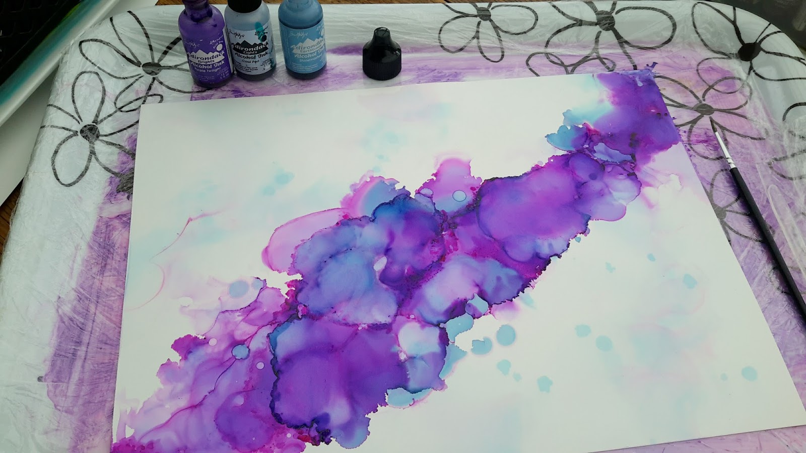
So for these cards I set up a kinda conveyor belt of stages as I had lots to make. I used a stitched square die first to create my card centrepieces and smooshed 3 different colours of distress inks and set them aside to dry.


I applied Liquitex Super Heavy Gel medium through a circle stencil and added a blue glitter before it dried. I've said it before (yawn) but I love this gel, it's great for adding texture and dimension.


A few sequins next, strategically placed...trust me, sequin placement in just the right spot is a skill worthy of a university degree course....lol.


To finish I added foam tape to the back for a little bit more dimension to the card.
Ta-Da!!
So, just 1 more sleep until the big day.
I hope Santa spoils you all rotten, but more importantly, don't forget to squeeeeeze the ones you love and tell 'em so.
Have fun!!

Friday 22 December 2017

Alcohol Ink Festiveness


Is it Christmas yet?
We're on the final countdown. Santa's probably buffing his sleigh, warming up the reindeer and unknotting the curly ribbon on our gifts as I scribe.
I love Christmas!


This year, as threatened promised, all of my family and friends got an alcohol ink painting, albeit a very tiny one, about 2 inches square to be precise.
I made 1 HUGE painting (seem to have mislaid that photo....Doh!), then chopped it up into tiny portions for each card.


I added some Gloss White Nuvo Crystal Drops et voila! Job done.


Just 3 more sleeps....Yay!

Saturday 16 December 2017

MFT - Bold Blooms


Ahoy!
Today I have a really easy-peasy card to share with you using the dotty stamp from MFT's Bold Blooms.


I used a selection of Versacolor inks in rainbow colours and dotted a pattern across my piece of card.


Once I'd stamped my pattern, I used Altenew's Bold Alphabet die-set to cut the letters for the name, in this case 'Beata', plus 3 additional sets of letters from scraps of white card. 


I stuck my patterned piece to my card base, added the white letters back into the gaps with glue and the dotty letters on last. The extra white letters give the dotty letters some dimension and make the name stand out. 


See....told yer...easy peasy. The hardest part, as per, was getting the sequins in just the right spot....lol.

Saturday 18 November 2017

Alcohol Inks - No 10


Hello and thank you for stopping by.
Today I have 'No 10', in my series of nattily named alcohol pieces, to share with you.


This is a 9" × 12" painting on Yupo using a selection of my favourite, nature inspired, colours. 


Some of my art will be ready for sale soon. If you are interested in any of them then please drop me an email for further details (link under profile). All of my paintings have been sealed with a varnish spray to prevent fading and will be sent in a 14" × 11" white, frame mount with a backing board and sealed in a protective, cellophane bag (UK only at present).


This is what it will look like if placed in a black, glassed frame. 
I see tree tops from above, on a bright spring morning, in this one. As always, I'd love to know what you see.

Saturday 11 November 2017

New Home


Ahoy and thanks for stopping by.
Today I have a card to share using a stamp from a company called One Four Zero that I bought years ago when I first joined this amazing, crafting community. 


I decided to highlight the houses by not colouring them in, except the one door, and just adding the sky and grass around them with distress inks and a stencil.


A few sequins and a sentiment from Clearly Besotted to finish.
A nice, simple card....I say 'simple'...but it still took me yonks to make...lol

Sunday 5 November 2017

Alcohol Inks - No 9


Ahoy and thank you for stopping by.
Today I have another alcohol inking to share called No 9.


I love how this one turned out, it looks like a view of Earth from outta space.


That's why I love alcohol inks, for their magical qualities, their ability to leave us seeing all different things within a piece.


I used Pitch Black, Slate & Patina (Adirondack) and the gorgeous Pinata 'Rich Gold', which I much prefer to the Adirondack version.


I see oceans meeting the land, what about you?


Winter is truly on the way now, stay snug n' warm and happy crafting!

Wednesday 11 October 2017

Alcohol Inks - No 8


An uber quick post today. 
Why?
Coz I've stoooopidly lost all my 'how I did this' photos...Doh!
What I can tell you is I've named it 'No 8', I've used blue and green alcohol inks (sorry I can't remember the colour names) and I love this one. 
Reminds me of my happy place...the great outdoors.
Thanks for stopping by and enduring my obsession with these inks.

Sunday 8 October 2017

Alcohol Inks - No 7


Ahoy!
 Allow me to introduce 'No 7', my latest alcohol ink creation and a colour I definitely need to use more often...blue.


Adirondack's 'Stonewashed' is a beautiful blue with hints of pink which ooze out as you work with it.


This is a 9" × 12" piece of heavyweight Yupo.


Up close you can see the depths of colour and the pink hues.


The final painting, as always, is treated with a clear varnish & protective UV coating and here's what it looks like when framed.
Thanks for stopping by and have a fab week.

Friday 29 September 2017

MFT Bold Blooms (Foliage)


Do you ever make a card that you love so much that you almost can't bear to send?
This was one of them and yet it took just a few minutes to make.


Sometimes I can sit for hours and can't make a card for love or money. The ol' mojo does a runner or what I make just doesn't feel right. Those that I pontificate over or stress about for days are the ones that either end up in the bin or push me to the point of selling EVERYTHING (again!)...lol.


I love the simplicity of this card. 'Foliagey' cards just make me happy.
I'm weird...I know.


I used one of the leafy stamps from MFT's 'Bold Blooms' and loosely stamped the coloured section. I wasn't worried about stamping it perfectly...I wanted the colour to go over the outlines in a relaxed style.


I personalised it using Memory Box's Classic alphabet die set and added a heap of sequins from Neat & Tangled (Ocean Waves).
I love these leaves..., they'd be great in autumnal colours. Hmmmmm....might try them on Christmas cards, coloured with glitter. 
Have a groovy weekend X

Monday 25 September 2017

VIDEO - Alcohol Inks - No 6


Coooooeeeey!
Me again...with ANOTHER alcohol inked piece....forgive me (lol).


I've made a video on this one to show you some of the process. I've had to speed it up a bit so as not to bore you to tears and to edit out my procrastinating, ummming n' arrring, spilling ink, dropping bits, etc.... 


This time I used some really zingy, 'sherbety' colours.... Adirondack Lemonade, Limeade and Flamingo.


This is a 9" × 12" piece of Yupo. As usual, I use 91% Isopropyl Rubbing Alcohol, flicking, blowing and a using a paintbrush to move the inks about.


After the video ended, I added more dots of coloured ink for some depth in the centre. As always, the finished piece is varnished and treated with UV protective coating.


Here's how I made this painting... which alongside all my other pieces, will be available for sale soon.


You can see my other videos on Youtube here (Jane Clempson).

Have a great week and thanks for stopping by.


Sunday 17 September 2017

Alcohol Inks - No 5


Allow me to introduce another of my alcohol ink paintings, named 'No 5' (catchy huh?)  


On this one I used Cool Peri, Stonewashed, Raspberry and Purple Twilight inks from Adirondack. I also used 91% Isopropyl alcohol and a 9" × 12" sheet of Yupo.


 I started by drizzling the alcohol over my paper and then added a few drops of ink diagonally across the sheet.


With my air spritzer, I smooshed the colours about to create an airy background.


I then repeated the process with more ink drops and alcohol until I had the intensity of colour I was looking for.


With the finest of paintbrushes, I added a dotty effect with the alcohol and the teeniest amount of ink, dripped onto the bristles.


Before framing, all of my pieces are varnished to give a protective coating...


...and here's what the finished piece looks like when it's framed.
Happy crafting!!

Related Posts Plugin for WordPress, Blogger...